For many people, summer is vacation time. For some, it’s
a time to get out the maps, get the car serviced, and hit the open
road. For others, it’s a time to purchase guide books and
book flights. But wherever we go in the world, most of us need
to know where we are relative to other places. That’s why
maps were made.
We all grew up studying maps, but there’s one problem we
weren’t aware of when we were young. Maps of the
world, in particular, are wildly inaccurate pictures of the world
as it exists. The problem comes from trying to transpose a
round globe onto a flat surface.
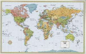
In 1569, Gerardus Mercator produced what is known as the
mercator projection as a aid to navigation. The projection is
relatively accurate around the equator, but much more distorted
the further you move north or south. Imagine slicing the rind of
an orange and laying it out on a flat surface. The center of the
orange would basically conform to the surface, but the ends,
representing the poles of the earth, would have to be spread to
cover the same space.
A projection misrepresents the relative size of land masses. For
example, in the Mercator projection, Greenland appears
roughly the same size as Africa. But in fact, Africa is some
thirteen times the size of Greenland. Alaska appears slightly
larger than Brazil while Brazil is five times larger.
In other words, nations in the southern hemisphere come out
smaller, and thus may appear less consequential, than nations in
the north. This gives a dominant appearance to North America
and Europe while diminishing South America and Africa.
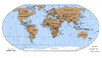
This problem was corrected by later elliptical projections, which
distort the shape rather than the size of the areas. Areas near
the equator are stretched vertically, while those far away are
squashed.
In 1989, a resolution was passed by seven North American
geographical groups objecting to the use of all rectangular-
coordinate world maps.
Despite advances, Internet maps rely on the older model
because it enables panning and zooming to local maps.
a time to get out the maps, get the car serviced, and hit the open
road. For others, it’s a time to purchase guide books and
book flights. But wherever we go in the world, most of us need
to know where we are relative to other places. That’s why
maps were made.
We all grew up studying maps, but there’s one problem we
weren’t aware of when we were young. Maps of the
world, in particular, are wildly inaccurate pictures of the world
as it exists. The problem comes from trying to transpose a
round globe onto a flat surface.
In 1569, Gerardus Mercator produced what is known as the
mercator projection as a aid to navigation. The projection is
relatively accurate around the equator, but much more distorted
the further you move north or south. Imagine slicing the rind of
an orange and laying it out on a flat surface. The center of the
orange would basically conform to the surface, but the ends,
representing the poles of the earth, would have to be spread to
cover the same space.
A projection misrepresents the relative size of land masses. For
example, in the Mercator projection, Greenland appears
roughly the same size as Africa. But in fact, Africa is some
thirteen times the size of Greenland. Alaska appears slightly
larger than Brazil while Brazil is five times larger.
In other words, nations in the southern hemisphere come out
smaller, and thus may appear less consequential, than nations in
the north. This gives a dominant appearance to North America
and Europe while diminishing South America and Africa.
This problem was corrected by later elliptical projections, which
distort the shape rather than the size of the areas. Areas near
the equator are stretched vertically, while those far away are
squashed.
In 1989, a resolution was passed by seven North American
geographical groups objecting to the use of all rectangular-
coordinate world maps.
Despite advances, Internet maps rely on the older model
because it enables panning and zooming to local maps.


Billie Silvey
June 2007

An eclectic website about Women, Christianity, History,
Culture and the Arts--and anything else that comes to mind.
Culture and the Arts--and anything else that comes to mind.
| Where in the World? |
In this issue of the website, we'll be considering other maps,
including visual representations of the lay of the land, street
maps "all around the town" in Los Angeles, even mapping our
spiritual journey.
I'd love to have your reaction. Just send it to
b.silvey@sbcglobal.net.
including visual representations of the lay of the land, street
maps "all around the town" in Los Angeles, even mapping our
spiritual journey.
I'd love to have your reaction. Just send it to
b.silvey@sbcglobal.net.